Fate Escape 2
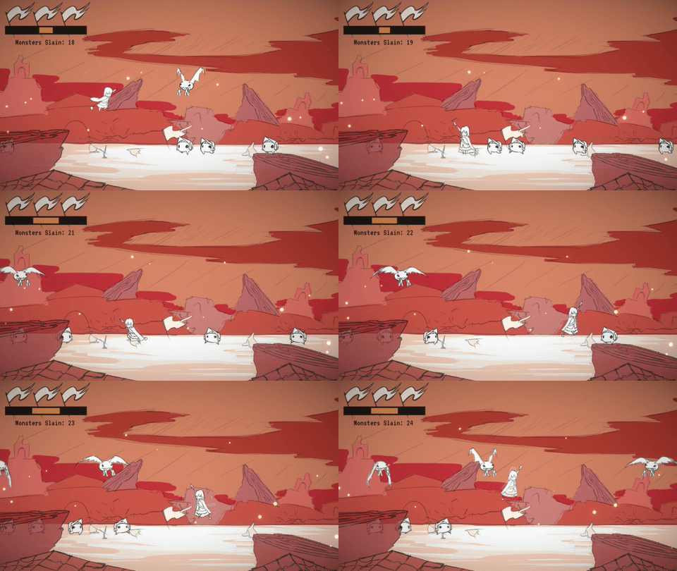
A small sequel of my endless action game, Fate Escape. I wanted to use this project as an opportunity to practice adding upon an old idea as well as get used to making game art assets again, so please excuse the art. You play as a hero who must protect their village from further destruction for the rest of eternity.
Music: https://peritune.itch.io/battle-tracks-jrpg-battle-music-collection
| Status | Released |
| Platforms | HTML5, Windows, macOS |
| Author | Hardwin Bui |
| Genre | Action |
| Made with | Unity |
| Tags | 2D, Hand-drawn |


Comments
Log in with itch.io to leave a comment.
Thanks for the great game! I think this is the best Escape game yet!
This game is pretty fun, and I enjoyed playing it!
Despite how you might feel about them, I honestly like the custom art assets you made quite a lot. The scratchy, black-and-white look to the characters complements the aesthetics of the battlefield quite well, and the game is overall pleasant to look at. There's something about the simplicity to the characters that gives me a comforting vibe; I'm sure the warm colors lend to that as well.
The controls feel tight and responsive. The difficulty mainly seems to stem from how the two types of enemies move at nearly the same speed, so you sometimes run into situations where it's difficult to kill either one without taking damage. I was going to comment that the dash felt unnecessary as it's generally preferable to just kill the enemies instead of avoiding them, but I realized after playing for a little while that it could be used to pass in between two vertically aligned enemies, so it definitely has a useful application as a means of escape.
The only criticism I really have is that the powered-up state (that is what the meter is for, right?) doesn't feel particularly impactful. My character seemed to be moving around a little faster and attacking with a bigger hitbox than normal, but it wasn't particularly obvious that I was under the effect of the buffs. Something more visual would probably help to communicate that my character is stronger now, but I can see how that would be hard to work in with the simplistic art style.
Thanks for playing the game and giving me feedback! I really do appreciate your criticism and general comments.
Although the art is part of an aesthetic I like, I felt like it could be done better and it’s something I hope to improve on. I think the background colors in particular is something I’m not really satisfied with it since I was shooting for more of a disastrous tone. I’m very glad you enjoyed the scratchy look though, it was something I wanted to experiment with for a while.
In terms of gameplay, I think you’re spot on with the powered-up state. Along with visuals, the mechanic wasn’t really worth going for nor felt rewarding with the system I provided. The dash also relied on this since its main purpose was to provide the player with a movement burst option so they can quickly get the dropped items.